Final-Designs.gif

Forest Fire Tee Designs


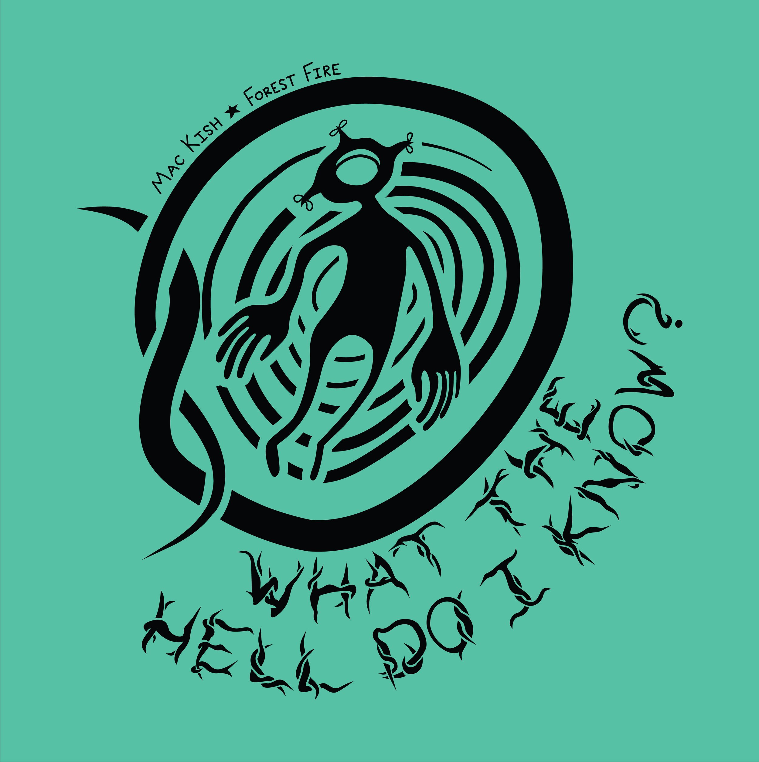
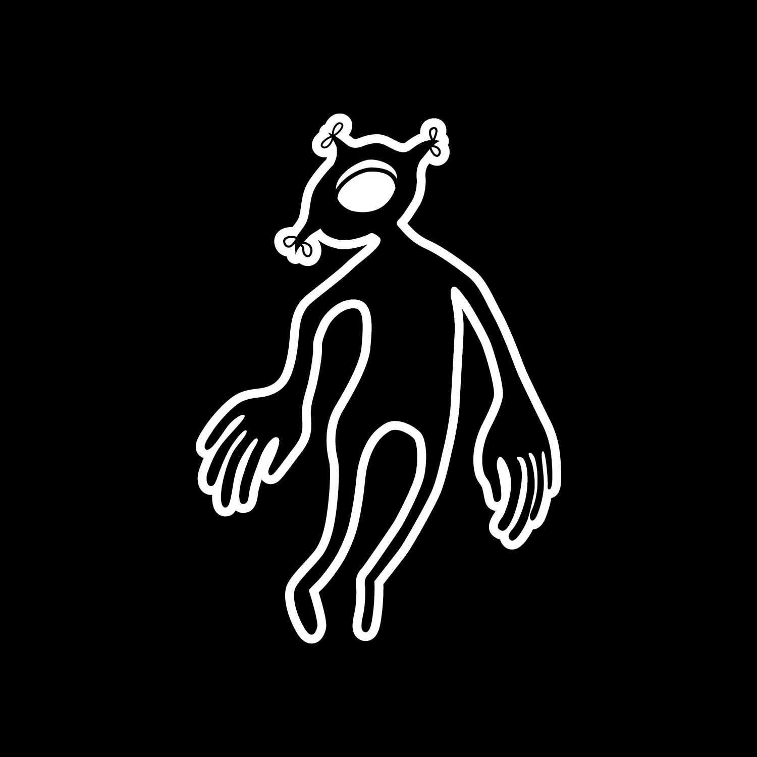
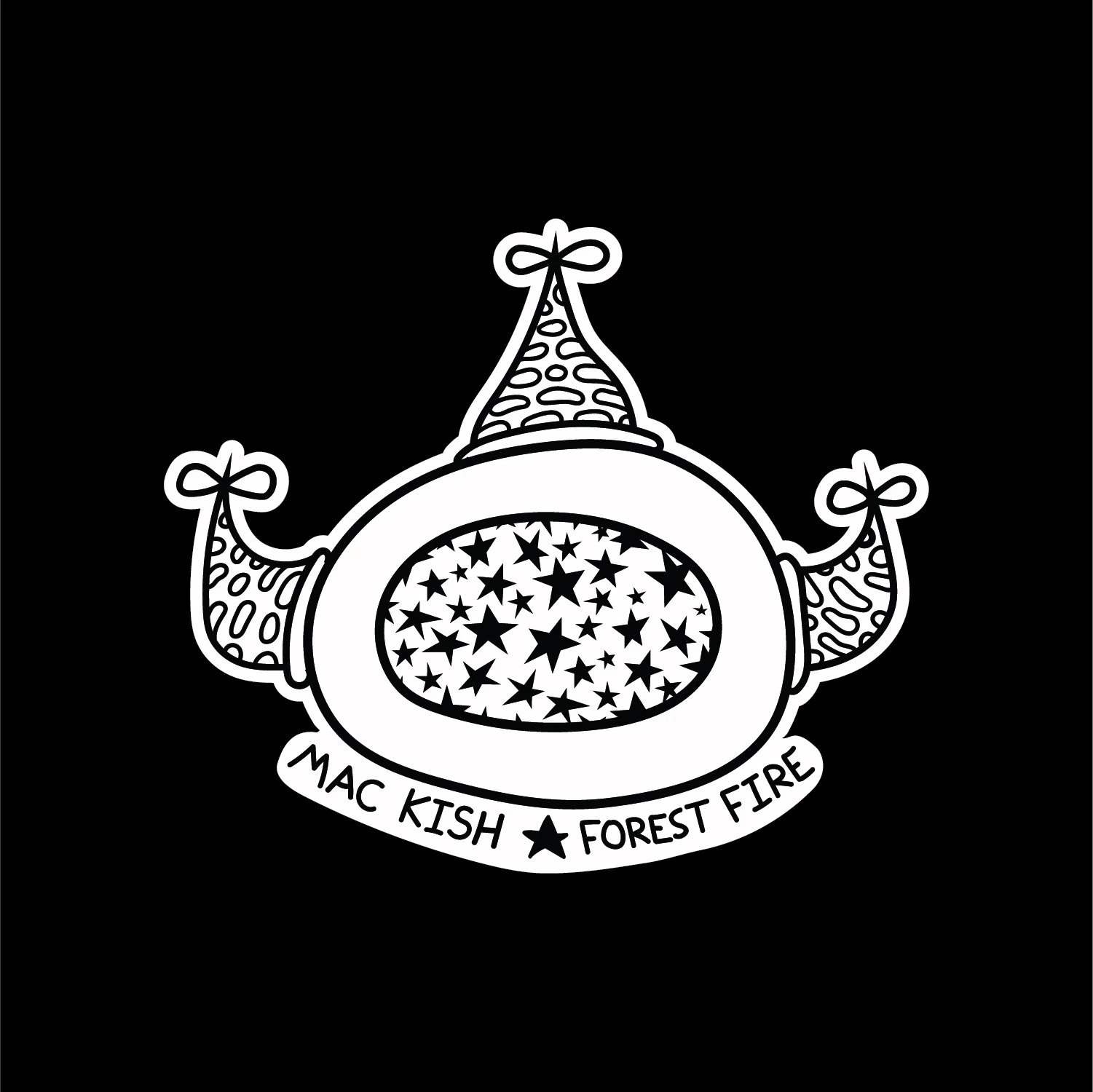
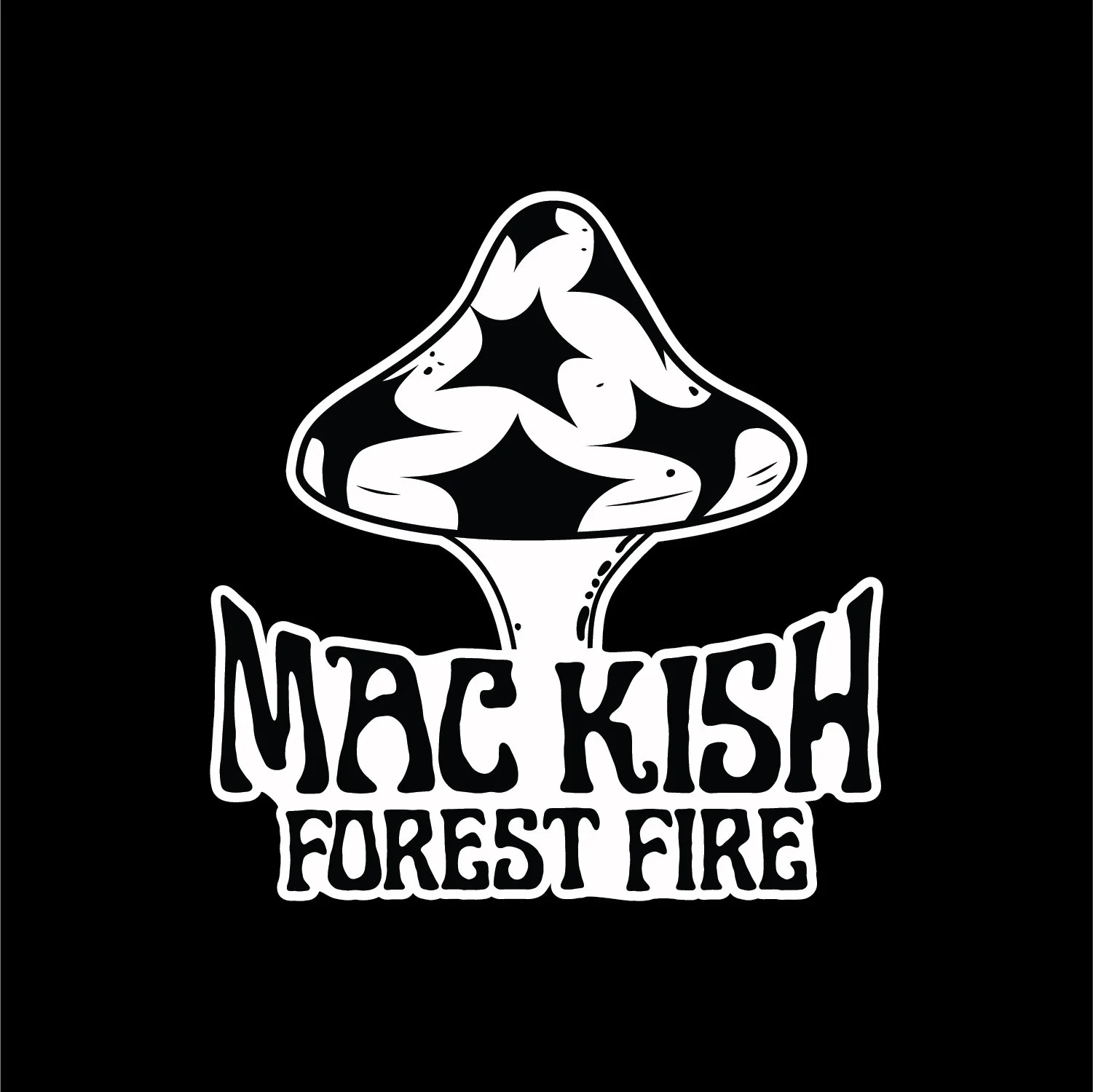
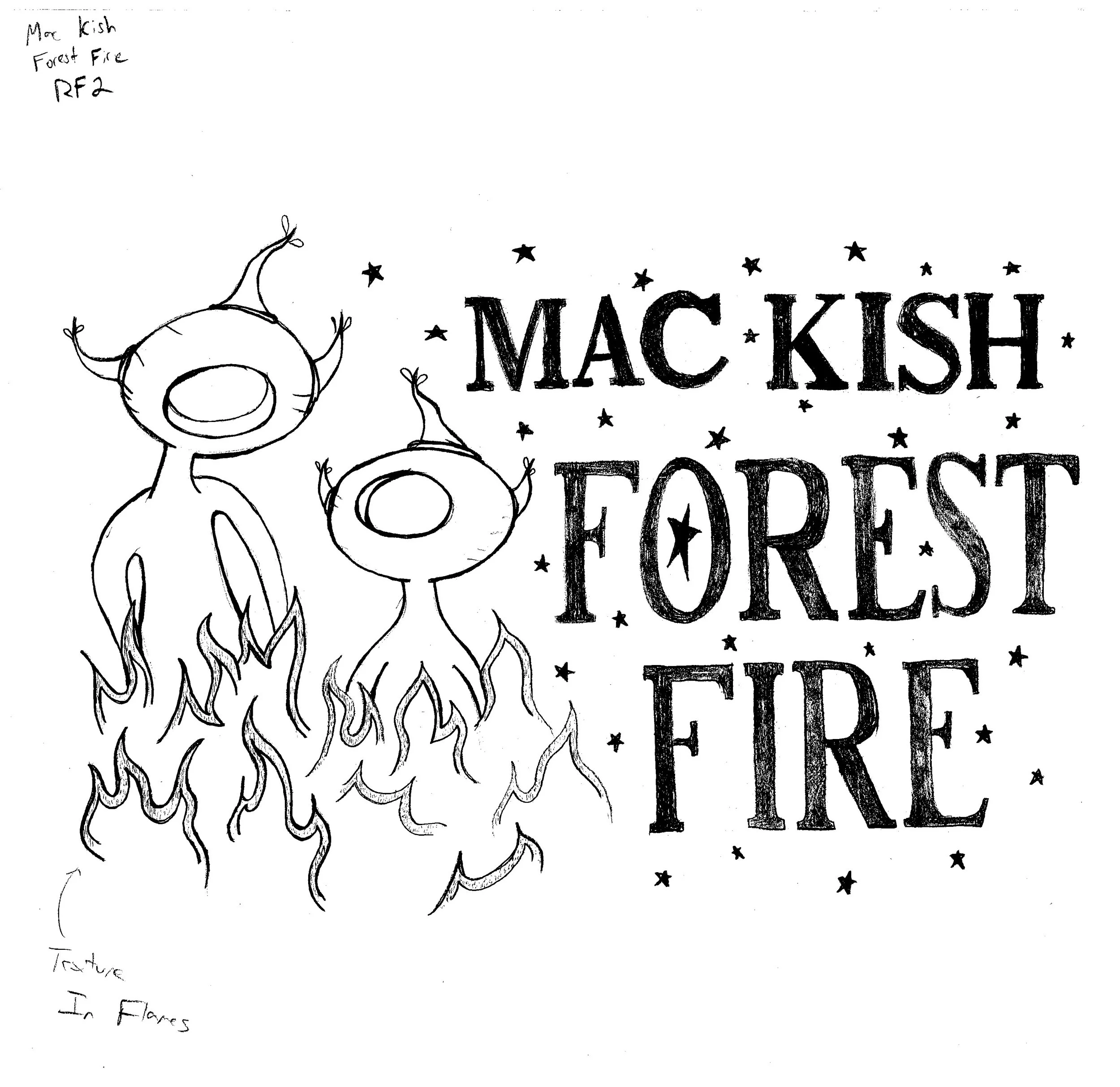
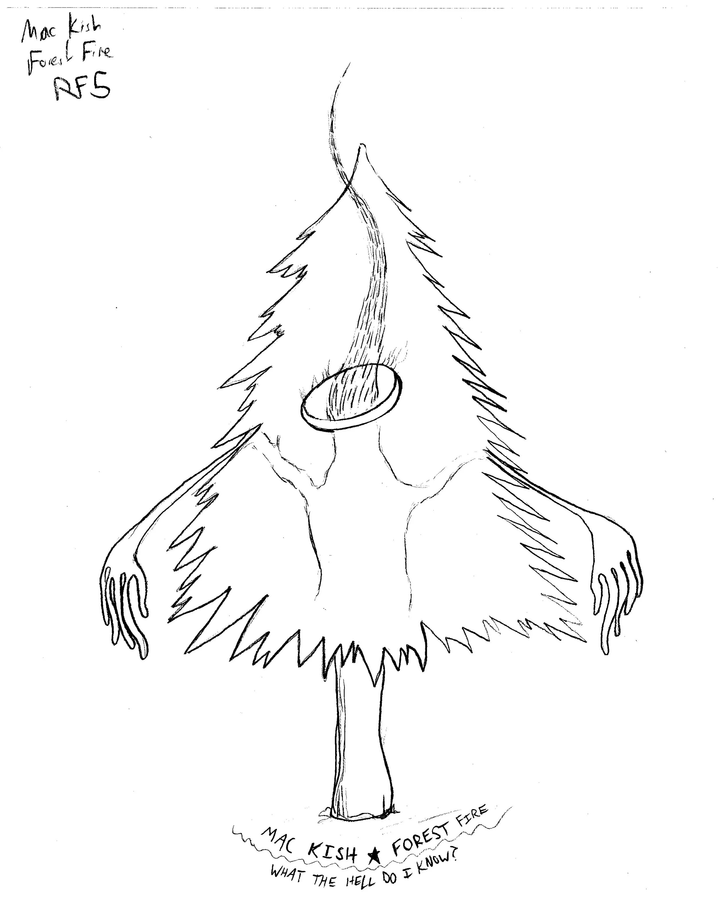
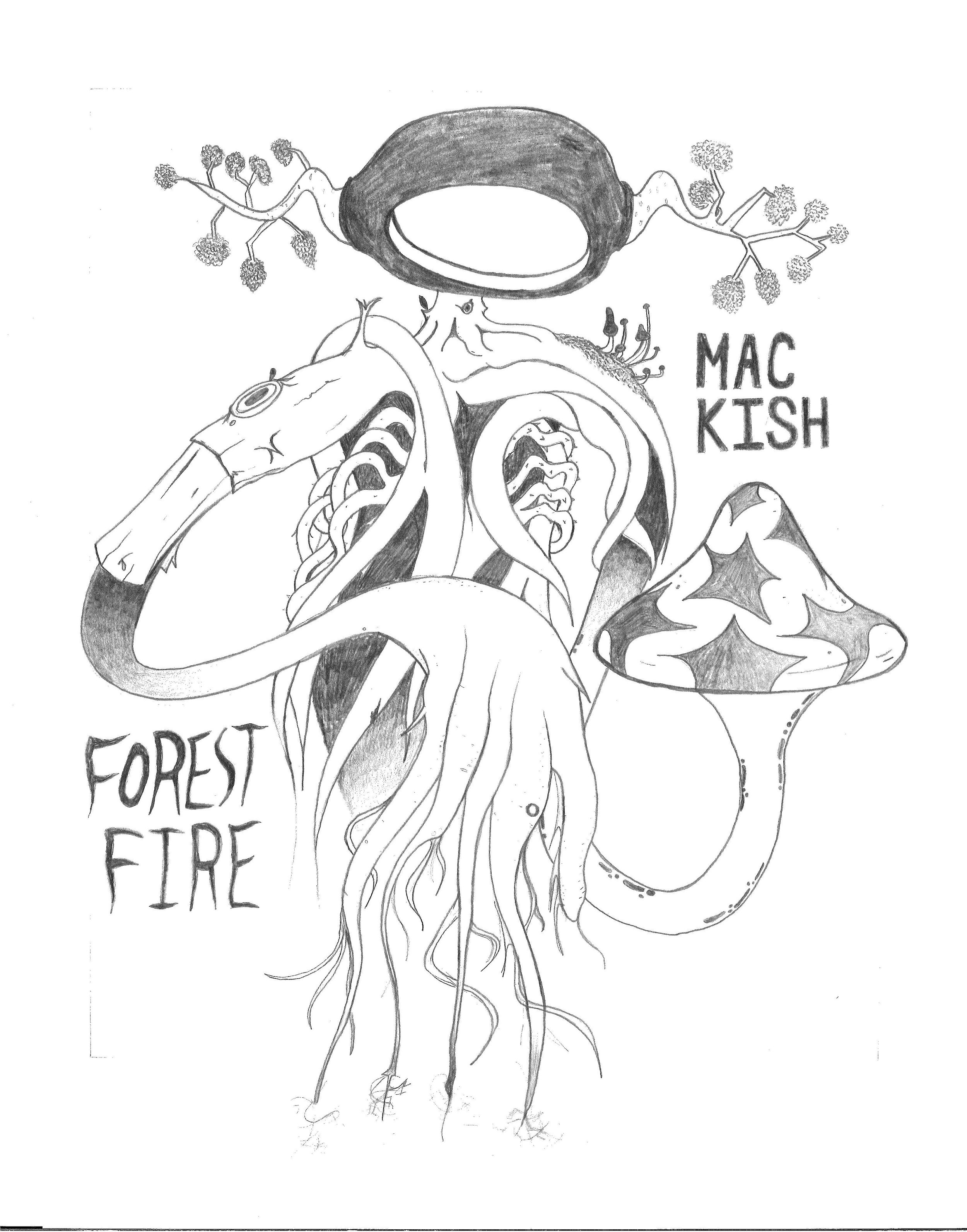
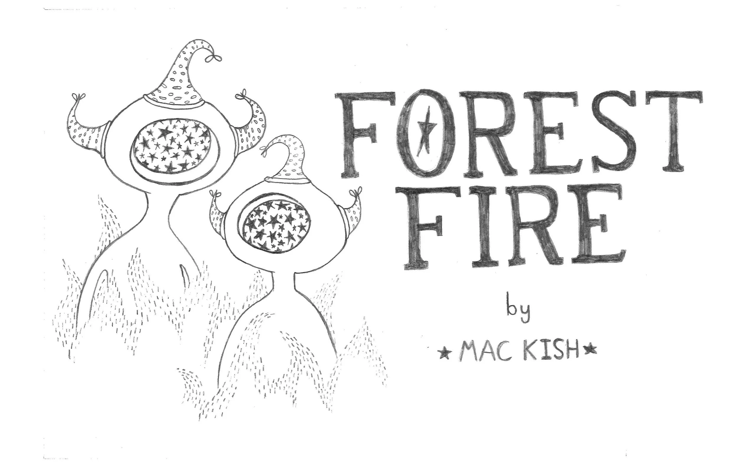
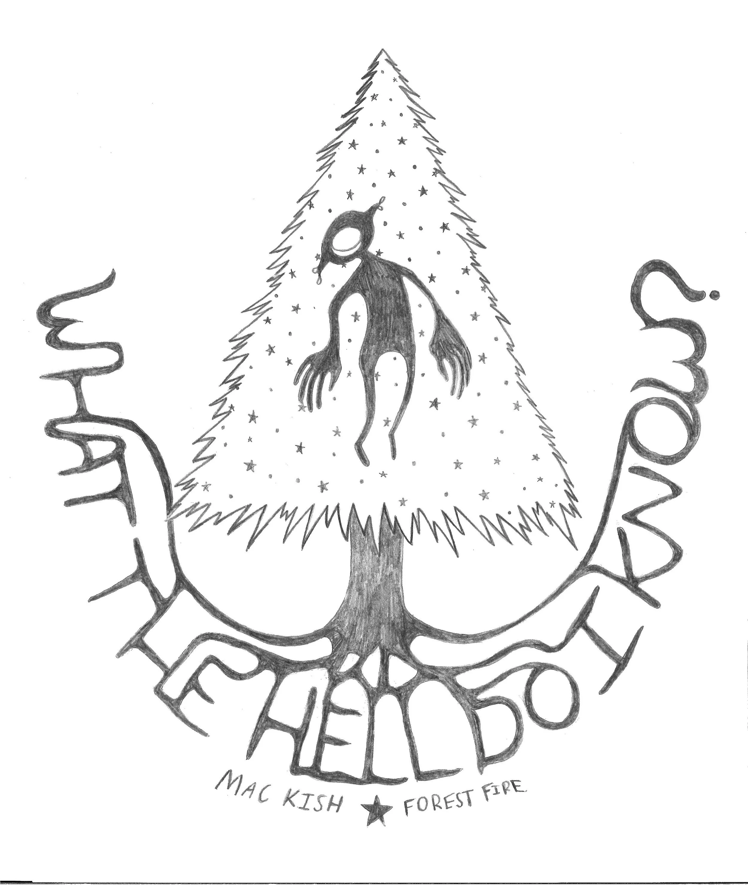
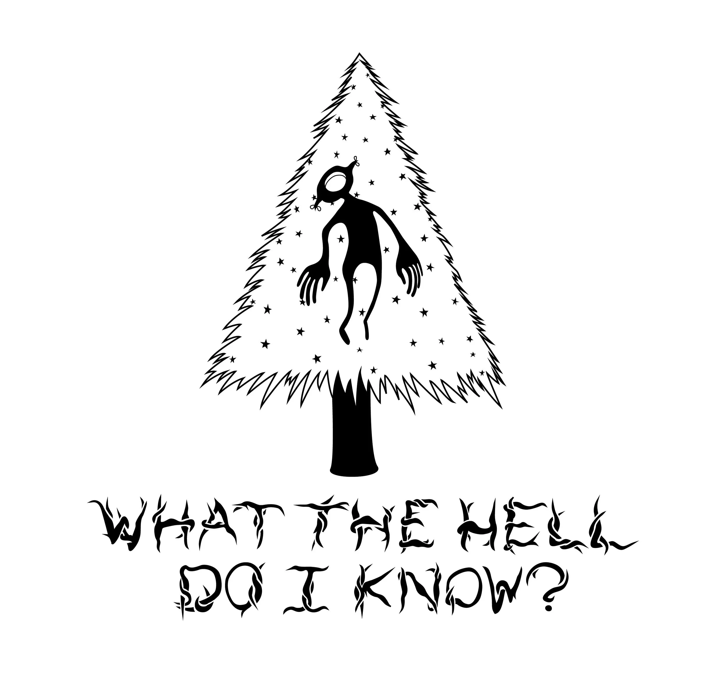
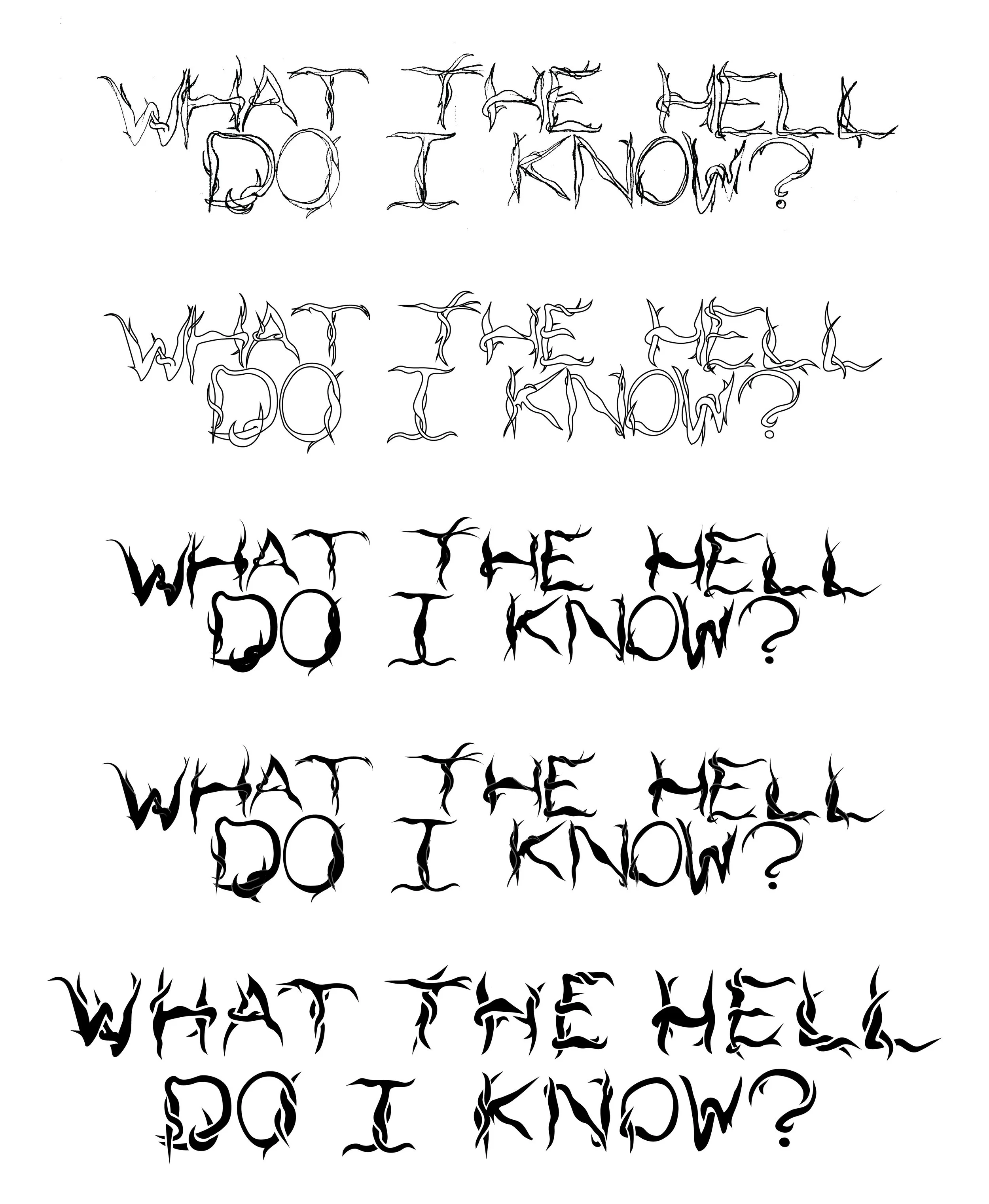
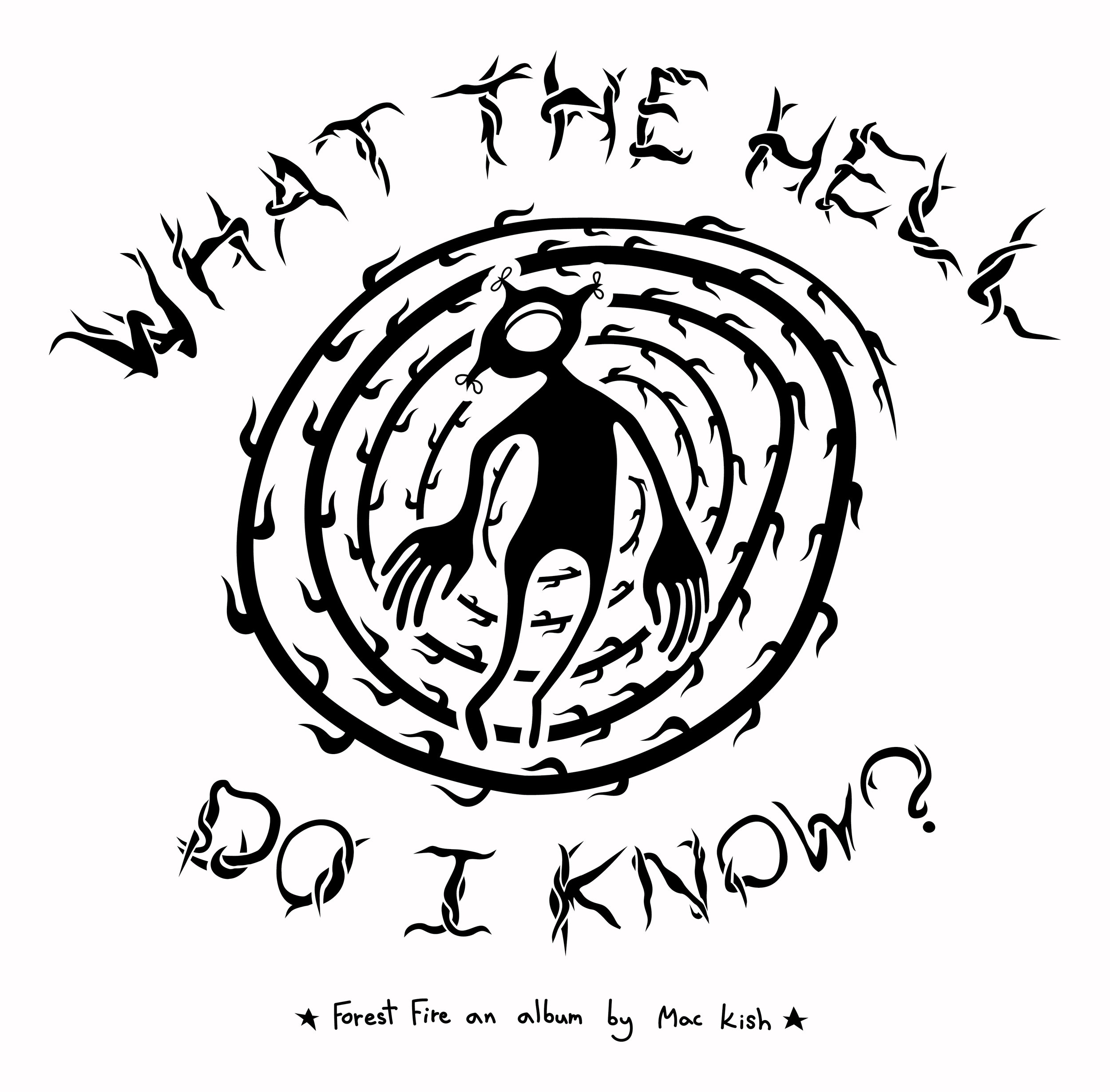
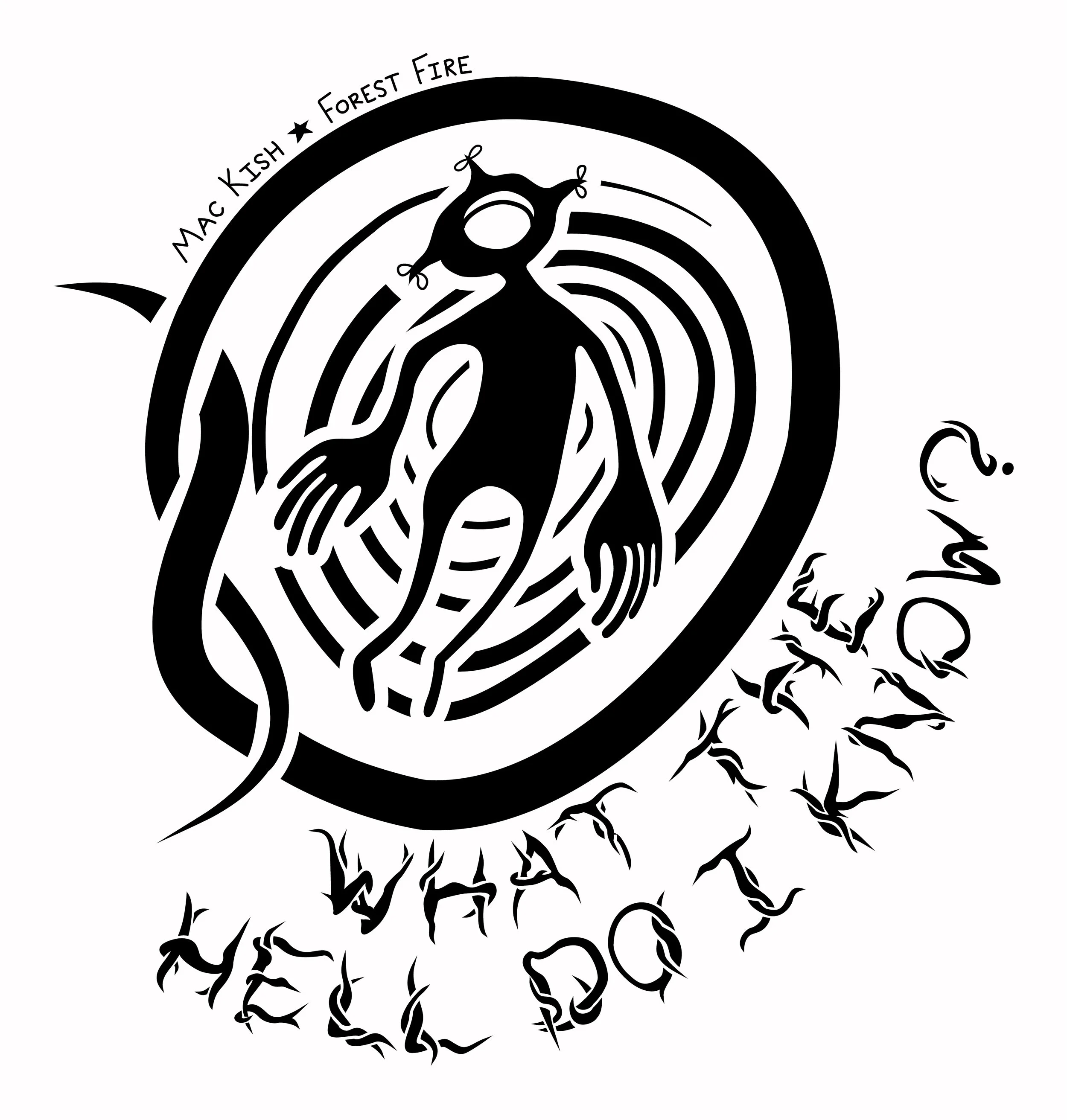
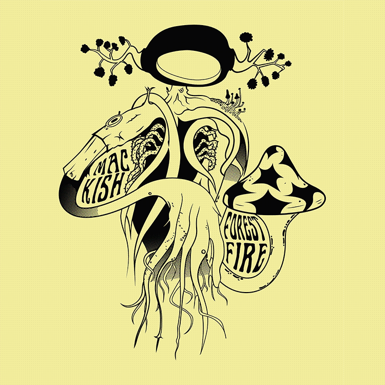
Forest fire tee designs

Tee Designs for Mac Kish’s album Forest Fire
Releasing under Squarelake Sounds on June 16th, 2023

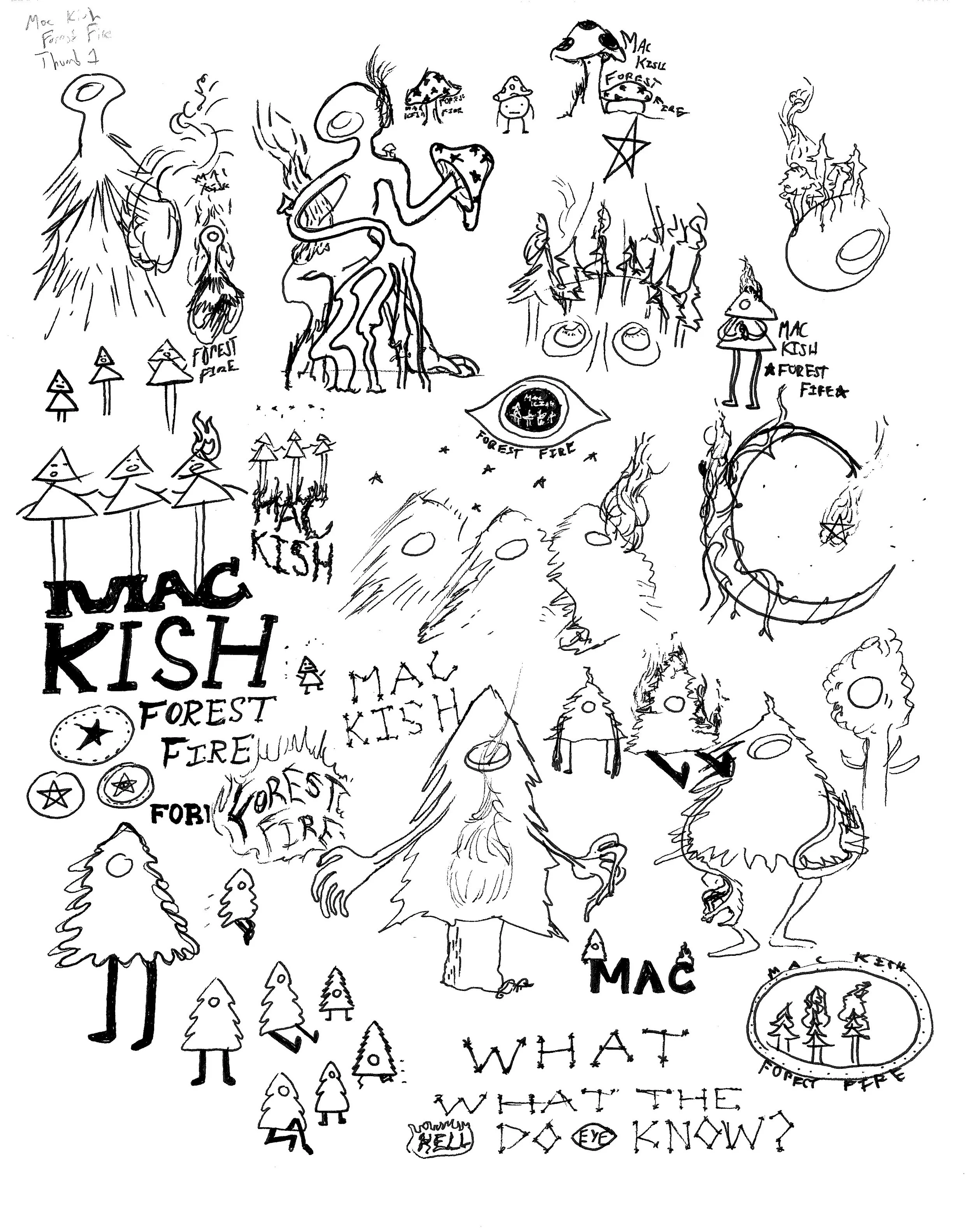
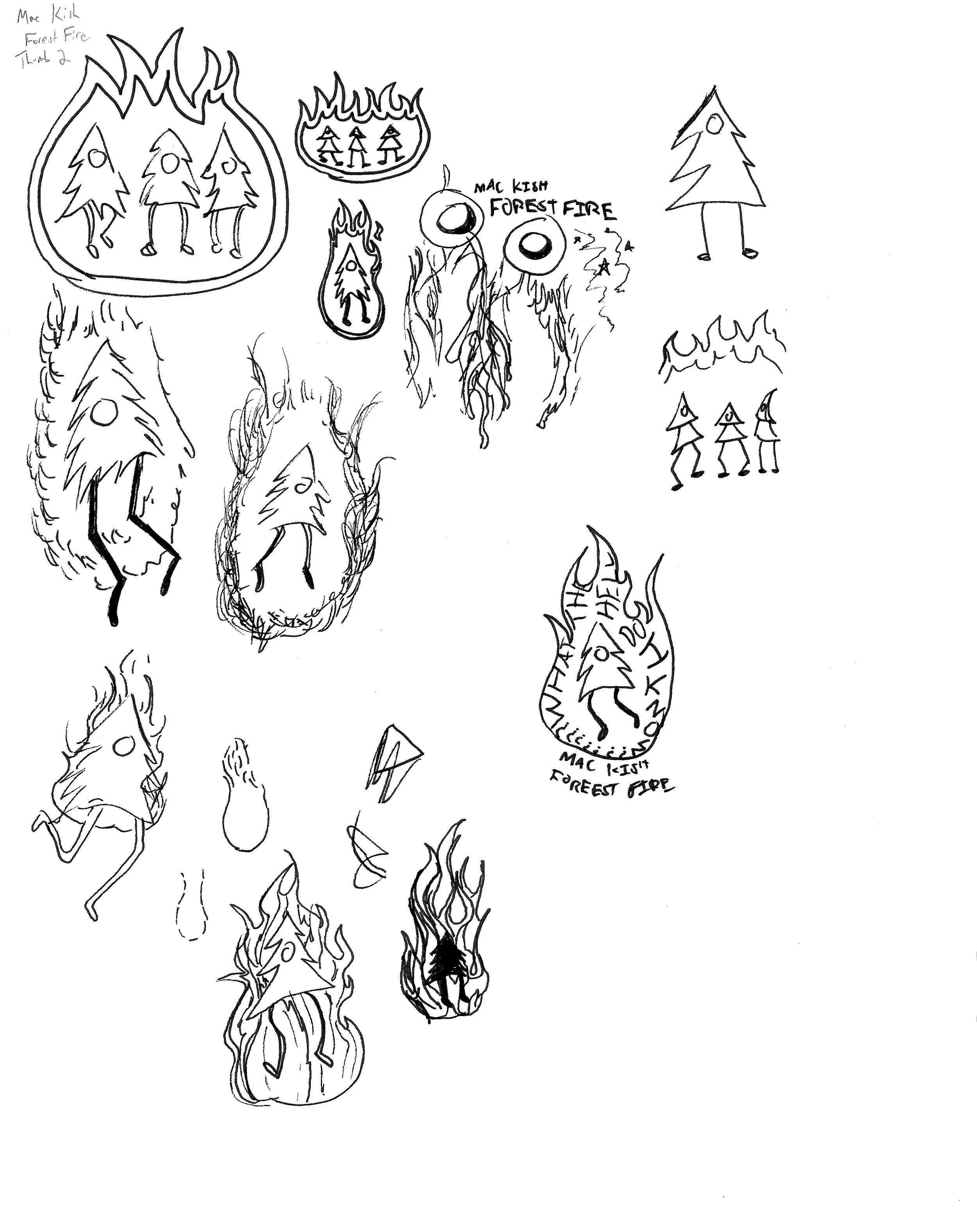
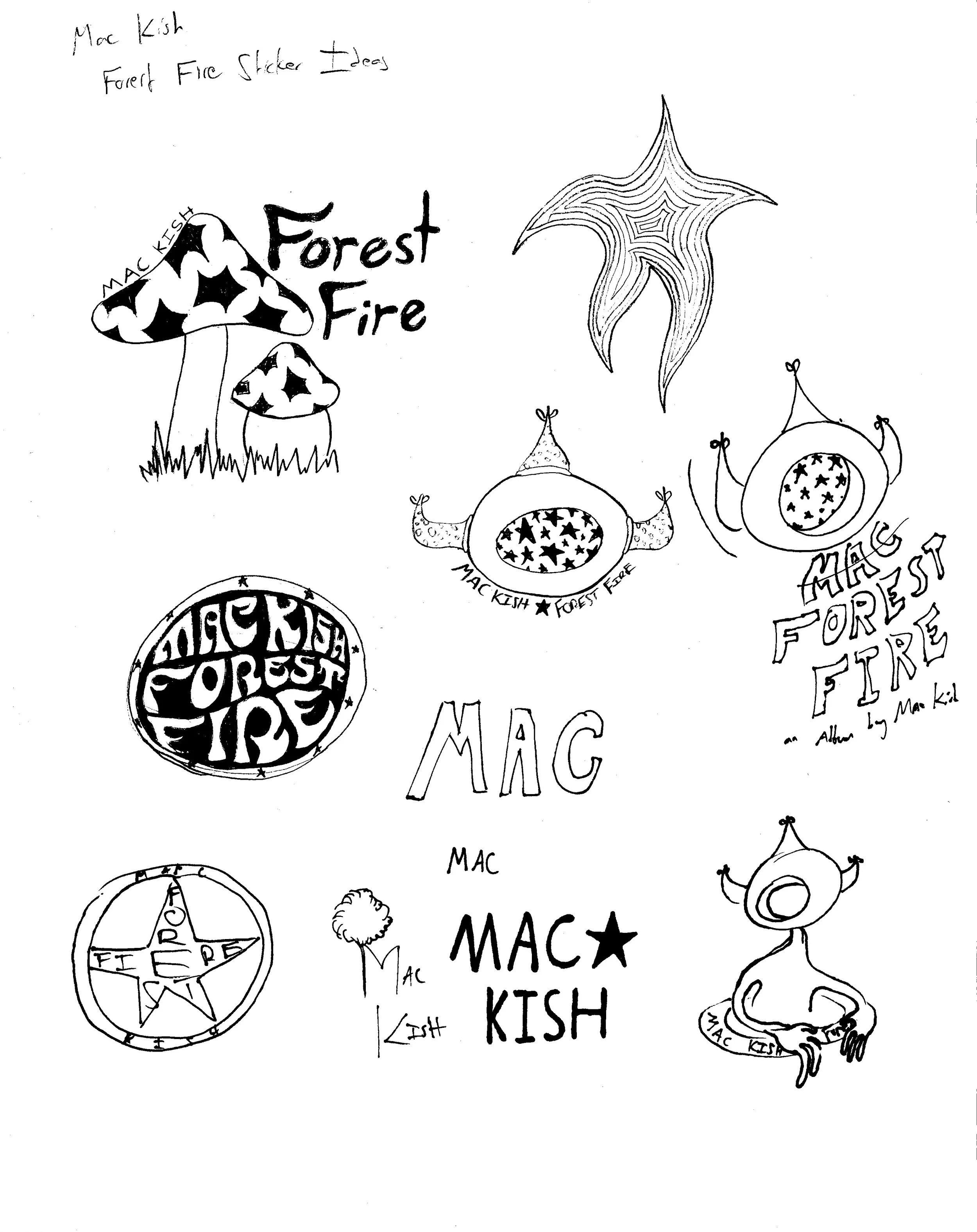
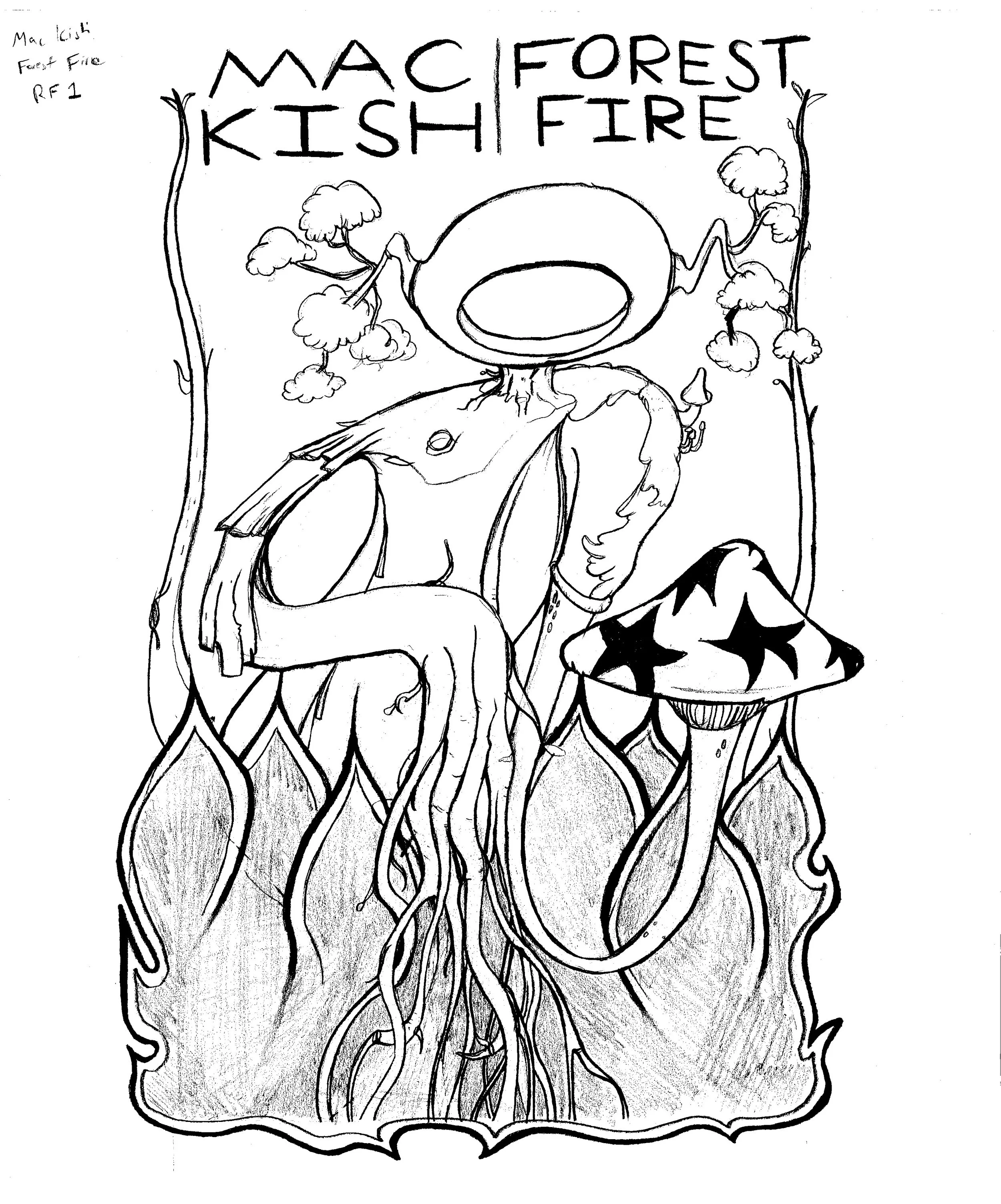
In January of 2023 I was contacted by local musician Mac Kish to produce three T-Shirt and Sticker designs for the release of his album “Forest Fire.” He wanted these images to incorporate the figures I sketch and post on my Instagram page. It’s a folky, punky, midwestern rock album that is in sound as it is in legitimacy, an independent (indie) album. Melancholic lyrics focusing on reflections of his past, realizations on identity lost all sung within a moody and ethereal soundscape; my drawings could be described in such terms as well. Forestry is not only represented in name, but is a visually distinct aspect of the album as its art is a painting of a forest fire. I thought to follow the trend and began sketching versions of my figures with branches, with roots, as trees in a midnight sky. After months of collaboration and changes, the images were complete in time to have stickers and shirts printed for his album release show on June 16th.


Final Designs Tee Designs

Sticker Designs

Initial Sketching

Rough Drafts

Refined Sketches


Third Design Blues

The third tee design for this project was the most difficult to complete and underwent heavy alteration. Once I had gotten into vectorization, the client began to express concern that although he enjoyed certain components, the main element looked too much like a Christmas tree. Through discussion though, we devised some alternate ideas that eventually lead to the final design seen at the top of the page.


First Iteration of the Third Design

This was the initial concept for the Third Tee Design up until the point where the client wanted to redesign it’s main element, the tree. This iteration was never fully realized though as the text below the tree was supposed to appear as roots connecting to the trunk.

The line “What the hell do I know?” is a lyric from one of the more poignant moments on the album.

Below is a progression of the of the final design’s typography from sketch to screen printable vector.


Second Iteration of the Third Design

Moving into this iteration, the client had made a suggestion that we could use the letter “O” from the text as a main framing element rather than a tree, an idea I avidly agreed with and pursued until eventually landing on these two final images, one that utilizes a framing element, and one that doesn’t. Although personally I prefer the image on the left, in the end the client decided on the right as he preferred the asymmetry of it.


Final print images yet to come